Does your business blog adhere to the standards of a perfect blog design? Equally important; do you know such standards? If not, then your efforts are misfiring every day causing lackluster performance. People are certainly not encouraged to read your content with all the attendant depressing results that are sure to follow.
If you want your blog to be in the same league as authoritative blogs in your niche, and of course you do, then learn what makes for a perfect blog design. It’s doable regardless of what you’re at right now.
1. Use Content Snippets
You’ve seen them on other blogs; we all have. Snippets are used on the your blog’s homepage; just a couple of paragraphs from the beginning of the post. After the snippet, which is a teaser, there’s a call to action to click and read the full post.

Why even bother using snippets?
A. Snippets allow your readers to quickly scan and decide if they want to read the full post. If your homepage is populated with snippets, people can scroll and scan until they find something that piques their interest.
B. Featuring the full post on your homepage in addition to each post published elsewhere with a unique URL creates a duplicate content situation. As you know, duplicate content puts a dent in your SEO efforts and hinders your ranking.
Test your call to action anchor text so you can optimize for highest click-through rate. Common anchor texts are: Click to continue, Click to read more, Read more, etc.
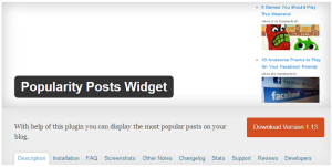
2. Implement Most Popular widget
You may already be familiar with this since you have a blog, and perhaps you’re already using it; if so, that’s great. This widget features sidebar content in the form of what’s most popular on your blog. One of the most popular uses of it is displaying the most popular posts. But you can use it for other purposes as well.

People are naturally curious about what other people like, and it’s curiosity that drives them to want to have a look. This widget is helpful because it draws visitors into your blog which is what you want. Think about it, greater time spent on your blog will help you, lower bounce rates will help with SEO scoring – all good.
3. Sidebar location
Numerous reports involving sidebar location, on the left or right, indicate the right side consistently outperforms the left side. You can find some disagreement here and most likely attributed to unique factors such as audience and type of content featured on the blog.
Since westerners read top to bottom and left to right, it seems a natural inclination for readers to be more comfortable with the page content on the left. This arrangement would then call for the sidebar on the right. The best option is for you to test it out for yourself.
Bonus Tip: Do include images
Images are excellent for capturing attention whether on blog posts or social media posts. Humans are naturally drawn to images over text, at least initially. And this is where you have a good chance of reeling people into your content.
The one caveat with using images has to do with the image itself. An attractive and relevant image always outperforms a more-or-less bland, boring image.
An image that is not relevant to the content causes confusion and is not desirable. Whenever possible, use images containing a nice mix of colors that complement each other.
Concluding Thoughts
There are more elements of a perfect blog design, and you are encouraged to learn more and take action on your own blog. None of this is hard to do, so it’s worth your time and effort.
Here’s one more thing you can do that will help boost social media traffic. You can find plugins that create scrolling social media buttons. Avoid adding too many buttons and of course the best thing to do is test.
You know how important social media is for traffic, list building and adding some extra juice to your SEO efforts.
Here’s how you can use social media signals to amplify and add an exponential compounding effect to your marketing. Definitely worth a look – at the very least.
Leave a Reply